PROTOMAPS Color Expolorations
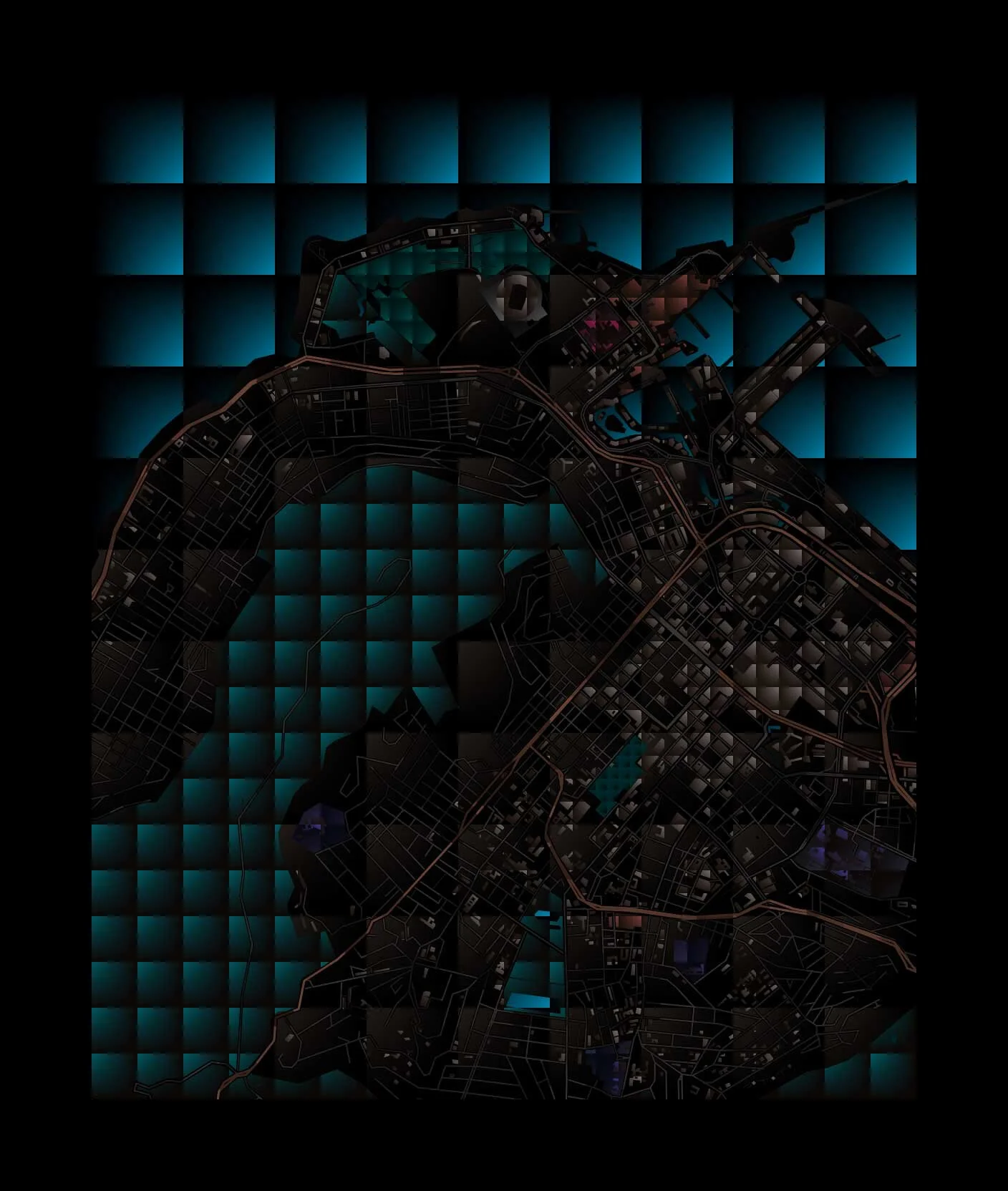
Protomaps Basemaps Themes
Protomaps is a free and open-source map of the world. Had the wonderful opportunity to work with Brandon Liu to create the following basemap themes.
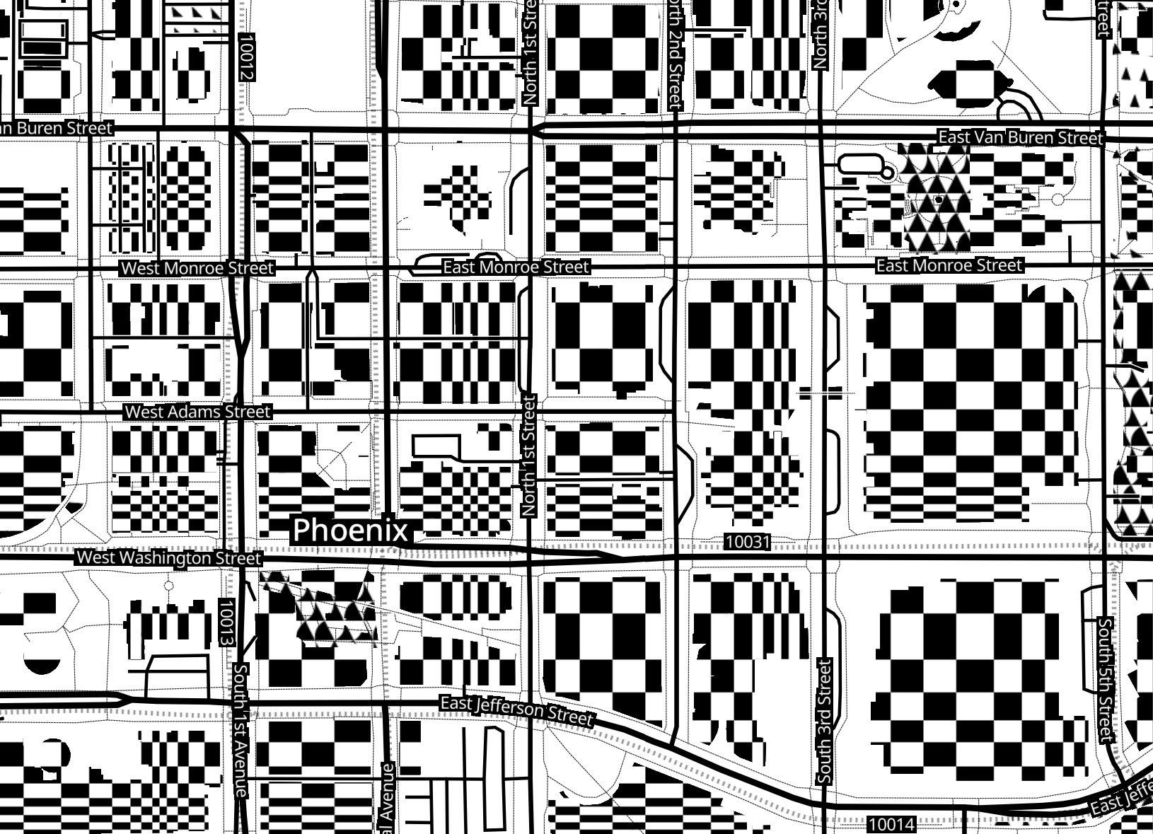
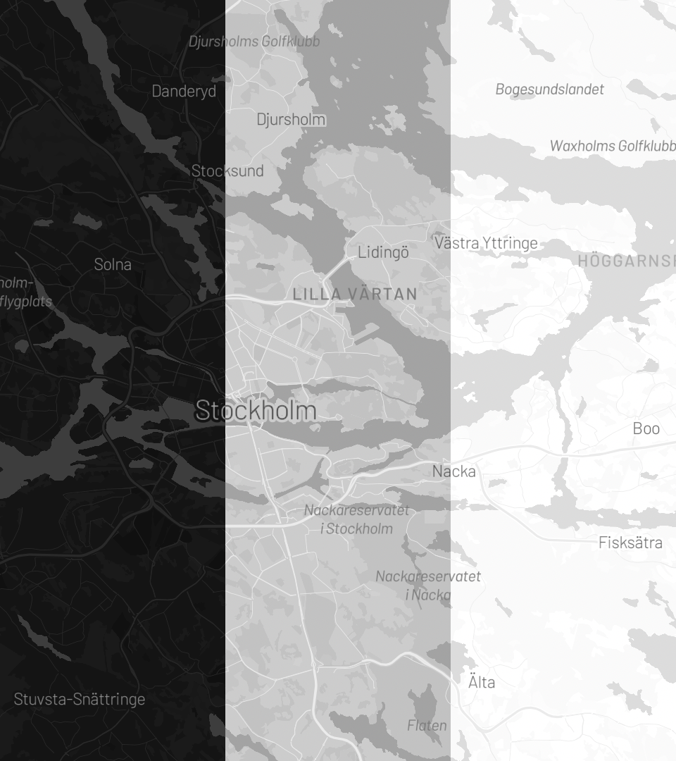
Light
Dark
Data Viz
Four Elements
Santa Cruz Mountains
San Francisco to Santa Cruz
Li Manila Scroll
Li - Amsterdam
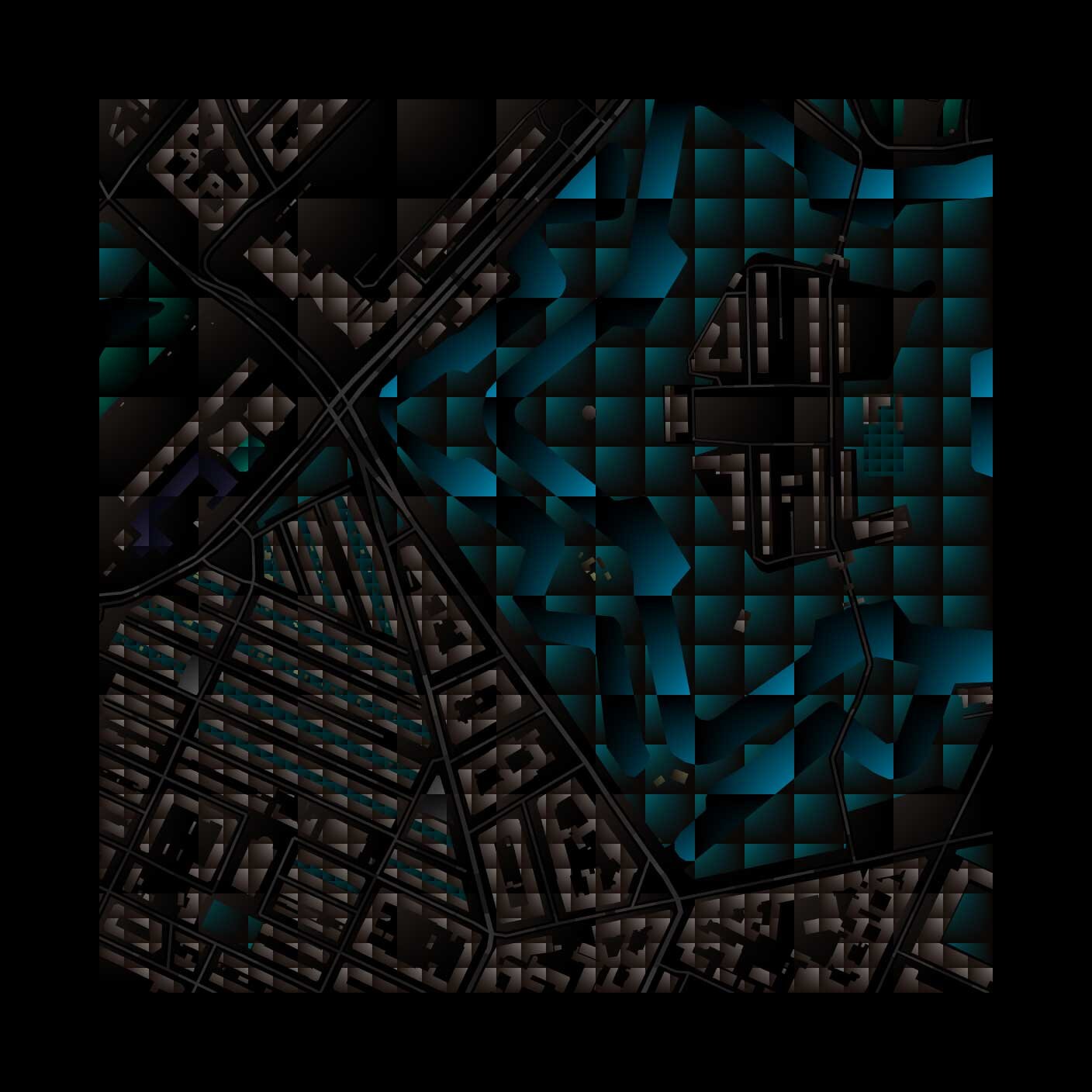
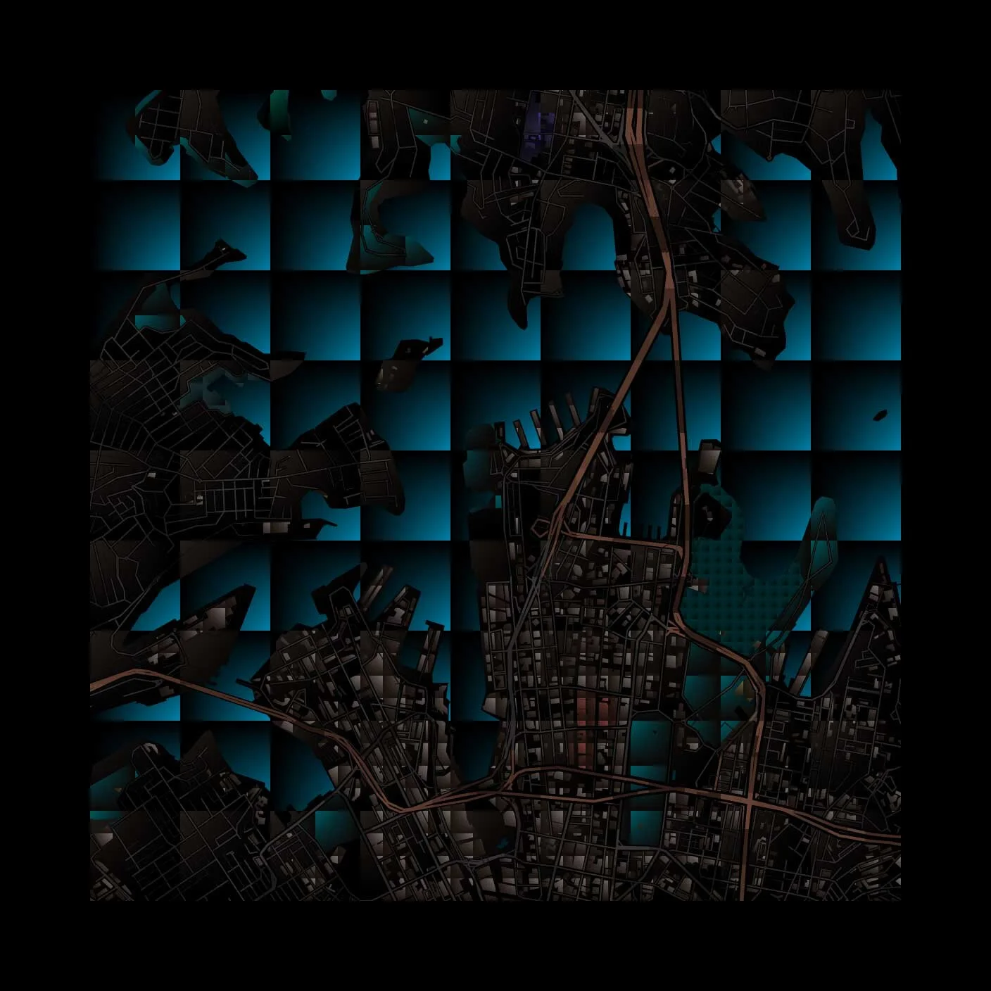
Pixel Color Studies, Part I
Kolkata
Copenhagen
Istanbul
Berlin
Tokyo
Sydney
Capetown
Honolulu
Buenos Aires
Visual Studies in Stripes, Part II
Los Angeles
Singapore
Dubai
London
Madrid
Amsterdam
Music by Carlos Niño & Miguel Atwood Ferguson – “8 Moons Blue” from Dublab’s #cc10 mix https://soundcloud.com/wearecc/dublabs-cc10-mix
San Francisco
Music from Dublab’s #cc10 mix https://soundcloud.com/wearecc/dublabs-cc10-mix
Visual Studies in Stripes: Frequency
ROME
NEW YORK
BEIJING
AMSTERDAM
TOKYO
Homage to Bridget Riley
“Perception is the medium.”
BARCELONA
LOS ANGELES
PARIS
NAARDEN
TOKYO
“For me nature is not landscape, but the dynamism of visual forces, an event rather than an appearance.”
DUBAI
DELHI
CORDOBA
FEZ
CAPETOWN
STOCKHOLM
BERLIN
BRASILIA
ROTTERDAM
The electric light is pure information
Marshall McLuhan
Electric Light
“McLuhan contends that all media - in and of themselves and regardless of the messages they communicate - exert a compelling influence on man and society. Prehistoric, or tribal, man existed in a harmonious balance of the senses, perceiving the world equally through hearing, smell, touch, sight and taste. But technological innovations are extensions of human abilities and senses that alter this sensory balance - an alteration that, in turn, inexorable reshapes the society that created the technology.”
Risograph Play
GRAPHIC SERIES
The GRAPHIC SERIES is a new set of maps created for data visualization. Here, I continue my exploration of drawing the planet and its forms.
In Explore the world of form with Morphology, I begin with the question: what is the visual language of cartography? Let’s explore this question through the medium of drawing. In this series, we will focus our exploration with three visual elements: the dot, the line and the pixel.
The visual elements are the basic substance of what we see, and they are few in number: the dot, line, shape, direction, tone, color, texture, dimension, scale, movement. Few though they may be, they comprise the raw material of all visual information in selective choices and combinations. - Donis A. Dondis, A Primer of Visual Literacy
Why the dot, the line and the pixel?
To deepen our understanding and purpose, we must go back to the root. What are the basic elements of our visual language? Just like the atoms that make up our world, our planet, we can return to the dot, the line and the pixel to help us understand and navigate the vast spheres of visual data that proliferate our everyday visual experience. It is an investigation of the medium in which we create meaning. It is also a meditation on how we create, from a single entity to a multiplicity of forms, the creation of new forms from a single element, the creation of a visual language. Dot by dot, line by line and pixel by pixel, we can explore and observe the forms that emerge. To draw is to discover.
Graphic representation constitutes one of the basic sign systems conceived by the human mind for the purposes of storing, understanding, and communicating essential information. As a “language” for the eye, graphics benefits from the ubiquitous properties of visual perception. - Jacques Bertin, Semiology of Graphics
See also TRON 2.0 — Creating a Visual Language of Scale
The Dot
Let us first explore the many definitions of the word dot.
According to Dondis in A Primer for Visual Literacy, “the dot is the simplest, irreducibly minimum unit of visual communication.” To Jung, it is “the symbol of a mysterious creative center in nature.” In The Book of Symbols, “It is referred to as dot, point, jot, tittle, monad, bindu and even mustard seed. In purely formal terms, it is the smallest visible mark. It has position, but no extension in space.” To Kandinsky in Point and Line to Plane, “The point is the result of the initial collision of the tool with the material plane, with the basic plane. Paper, wood, canvas, stucco, metal — may all serve as this basic plane. The tool may be pencil, burin, brush, pen, etching-point, etc. The basic plane is impregnated by this first collision.” In our case, the plane is the pixel display, and the mark made digitally through the language of 0s and 1s.
Building a World Out of Dots
Dot by dot, through repetition, we can create a texture.
By changing the tone, another texture is created.
If you noticed, the dots are arranged in a structure.
By scaling the dots larger or smaller within the structure, we can create even more textures.
Let’s create even more variation by looking at how we draw the dot itself. Let’s start with these three dot styles:
See the variety of textures with all the rules combined!
Dot textures applied to earth, water and various landuse areas
Let’s take a quick tour around the new world we just created.
Earth & Water
From top, left to right: Stafford, New Jersey; Fort Lauderdale, Florida; Bulacan, Philippines; Thanh Binh, Vietnam; Dubai, UAE; Vinkeveen, Netherlands
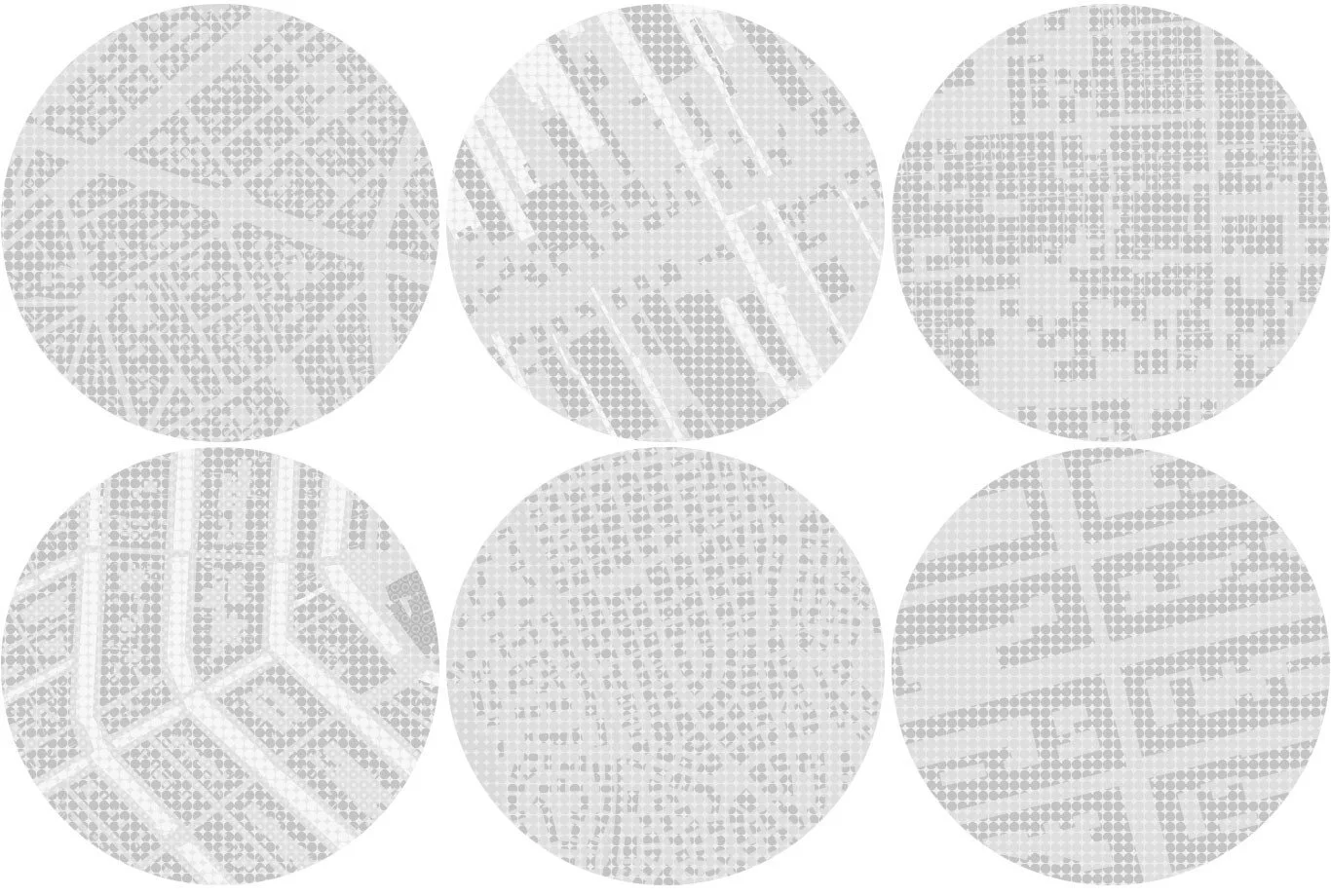
Buildings
From top, left to right: Paris, France; Rijsenhout, Netherlands; Manila, Philippines; Amsterdam, Netherlands; Rome, Italy; Stockholm, Sweden
For this particular map, light gray tones were chosen for the creation of a low-contrast data visualization map. View the map.
Let’s try something new and create a darker toned map and apply the same rules. Notice how these very same textures feel different after a change in tone.
Earth & Water: Stockholm, Sweden
Edges
Since we are drawing areas of the planet with the variety of textures we’ve created, let’s focus our attention on the edges where two textures meet and explore the visual forms that emerge between two areas. What are edges? In The Image of the City, Kevin Lynch describes edges as:
“the boundaries between two phases, linear breaks in continuity: shores, railroad cuts, edges of development, walls… Such edges may be barriers, more or less penetrable, which close one region off from another; or they may be seams, lines along which two regions are related and joined together.”
See where earth and water meet on Ocean Beach, San Francisco.
View the coastal edges formed by the mouth of Chesapeake Bay in Norfolk, Virginia.
Connect the coastlines of Denpasar, Sicily, Doha, Bodrum, Barcelona and Venice below!
Let’s see another kind of edge, where built-up areas end in Mexico City, Rome, Cebu, Athens, New York and Sicily.
From the top: Mexico City, Rome, Cebu, Athens, New York and Sicily
We’ve now created a dark-toned low-contrast data visualization map as another option for overlaying data. View the map.
Note: To learn more about the cartographic forms we have applied these visual techniques to, I suggest reading Explore the world of form with Morphology. See also the visual story of Bubble-Wrap at Mapzen, Unboxing Bubble Wrap.
Let’s continue our drawing exploration and try another structure in the same darker range, but with a higher contrast.
By scaling the dots within the structure, we can create darker and lighter tones. This technique is very similar to the halftone dot technique where continuous tone is perceived by the eye.
Let’s try this technique to describe terrain on the some of the highest peaks on our planet. Below is Mount Fuji followed by Mount Damavand, Mount Kilimanjaro and Chimborazo.
From top to bottom: Mount Fuji, Mount Damavand, Mount Kilimanjaro, Chimborazo
This is a higher contrast map in dark tones displaying terrain as another option for data visualization. View the map.
XYZ
These maps are part of the exploratory work being done at HERE XYZ. HERE XYZ is a cloud-based, real-time location data management service that lets developers and map makers quickly create web maps and manage location data. It is built on open source and open standards, and delivers your data in real-time. Upload your own dataset or use an existing dataset to HERE XYZ.
Since our map is built with Tangram, here is a tutorial on how to build a Tangram map with your data from XYZ Spaces. Tangram is an open-source map renderer, originally developed at Mapzen and now a project under the Linux Foundation. What is it? As described on Mapzen, Tangram is a renderer:
…designed to grant you ludicrous levels of control over your map design. By drawing vector data live in a web browser or mobile device, it allows real-time map design, display, and interactivity. Using OpenGL, Tangram saddles and rides your graphics card into a new world of cartographic exploration. Animated shaders, 3D buildings, and dynamic filtering can be combined to produce effects normally seen only in science fiction.
Below are a few data visualization examples using our new maps displayed in Space Invader, another XYZ Labs project. It uses Tangram to let you inspect and analyze data in an XYZ Space and dynamically draw it on top of these new XYZ dot maps. (We’ll talk about it more an upcoming blog post, but you can access it from the CLI using):
here xyz show <spaceID> -v
Victoria Bike Lanes
Bike lanes in Victoria, British Columbia, Canada
Here’s a map of bike lanes in Victoria, British Columbia. View the map.
Skeggs Bike Trail
View elevation changes on a bike ride through Skeggs, a biking playground in the Redwood forests of the Santa Cruz Mountains in California. View the map.
Graphic Series
The Graphic Series maps are a work in progress. Stay tuned for the next blog post on lines and pixels.
View the xyz dot maps on Github:
https://github.com/sensescape/xyz-dots
Nature is a Dictionary
“Nature is a dictionary
One draws words from it”


